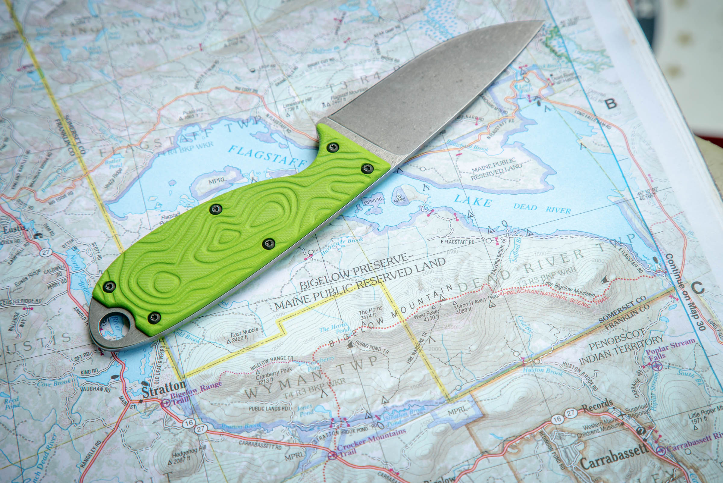
Why We Choose High-Visibility Colors
At Walker Knife Co., we made a deliberate decision to step away from traditional earth tones in many of our knife designs. Not to be different for the sake of it—but because visibility matters when a tool is meant to be used, not admired.
![]()
Function Comes First
Our knives are built around real scenarios: cold hands, moving water, low light, elevated heart rates. Situations where fine motor skills degrade and attention narrows. In those moments, the ability to quickly locate your knife isn’t a nice-to-have—it’s part of the tool’s function.
High-visibility colors solve a simple but critical problem:
If you drop your knife, you can find it.
On a riverbank. The forest floor. The bottom of your boat. In the snow. In a dimly lit camp at the end of a long day.
When stress is high, contrast beats camouflage every time.

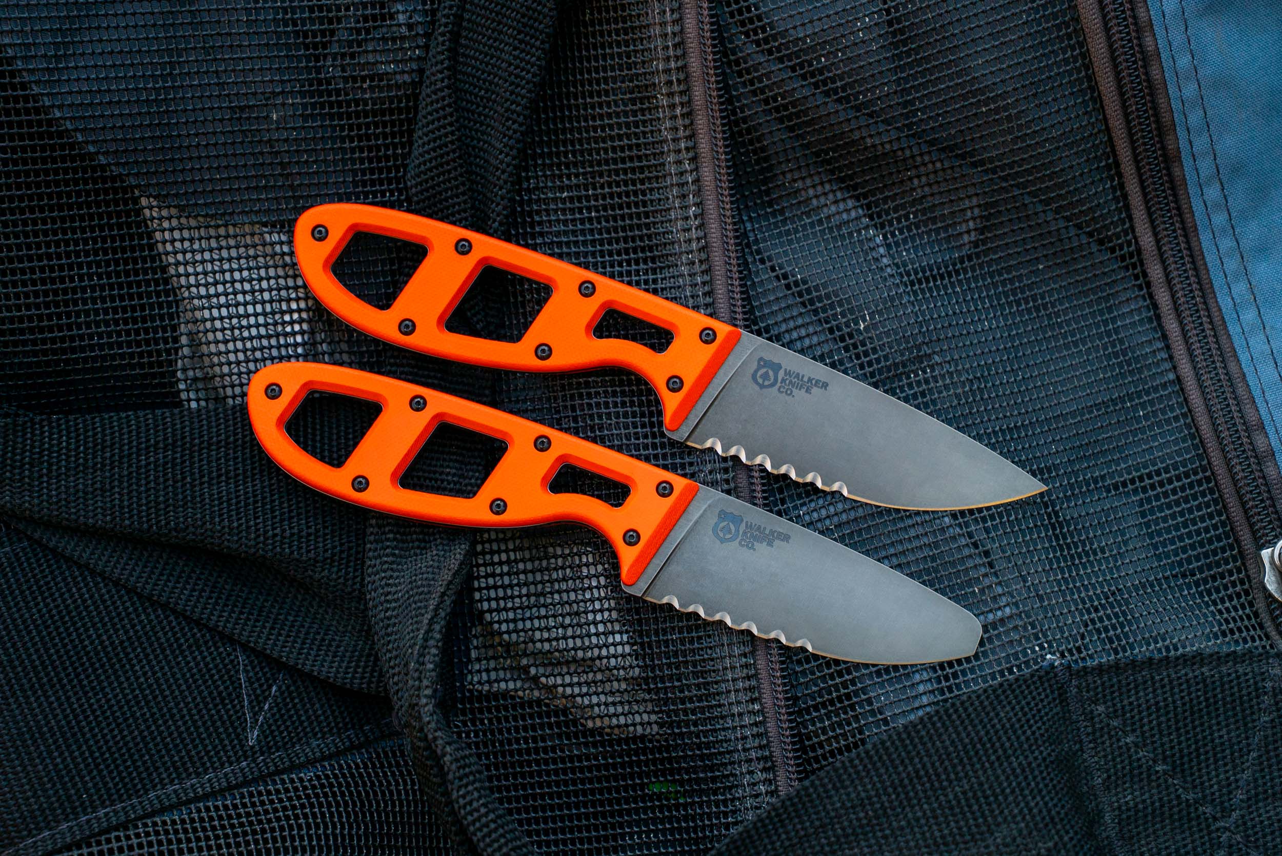
A Tool You Can See Is a Tool You Can Use
In high-stress environments—whether that’s whitewater, cold weather hunting, or fast-moving camp work—your brain is already overloaded. Vision narrows. Fine detail fades. Bright, high-contrast colors cut through that noise.
That’s why safety equipment across nearly every industry leans toward high visibility. Helmets, throw bags, life jackets, first-aid gear—none of it is designed to blend in. Knives used in those same environments shouldn’t be any different.
A knife that disappears into the background may look good on a workbench. A knife you can spot instantly is the one that gets back into your hand when it matters.
Breaking From Tradition—On Purpose
Choosing high-vis colors wasn’t about rejecting tradition; it was about questioning whether tradition was serving the user.
Earth tones come from a time when knives were primarily judged by aesthetics, collectability, or a romantic idea of the outdoors. Our knives are judged by whether they perform when things are messy, wet, rushed, or imperfect.
That mindset shows up everywhere in our designs—from sheath retention and mounting options to handle geometry and material choices. Color is just another layer of function.

High-Visibility Is a Functional Aesthetic
There’s a misconception that bright colors are loud, flashy, or gimmicky. In reality, they’re honest.
High-vis says:
This tool is meant to be used.
This tool is meant to be found.
This tool prioritizes performance over nostalgia.
We don’t believe function and good design are opposites. We believe function is good design. When a color choice improves usability, reduces frustration, and lowers the chance of losing a critical tool, that choice becomes part of the knife’s engineering—not decoration.
Not Every Knife Needs to Disappear
There’s still a place for subtlety. Not every environment demands high visibility, and not every user wants it. That’s fine. But for the work our knives are designed to do—on rivers, in the woods, in real conditions—we believe visibility earns its place.
A knife doesn’t need to hide to belong outdoors.
Sometimes, the smartest tool in the kit is the one you can see immediately, grab without thinking, and trust without hesitation.
That’s why we use high-visibility colors.